Smarter Typography: Where Design Meets Function
Typography is no longer just a design afterthought—it’s a core part of the user experience. In 2024, smarter typography is giving creators and developers more precision, flexibility, and brand expression across screens, devices, and user needs.
Greater Creative Control
Modern design systems now allow creators to fine-tune typography without sacrificing speed or performance.
- More customization options without bloating load times
- Fine-grained control over font weights, sizing scales, and line heights
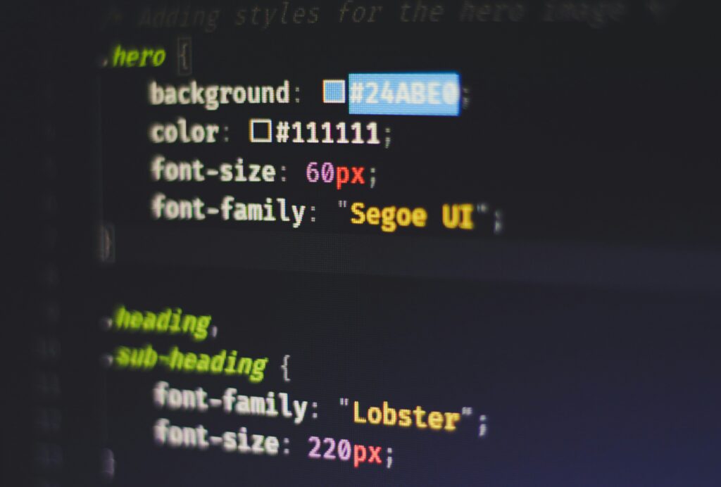
- Web-safe type enhancements that maintain design integrity across browsers
Typography That Responds in Real Time
Responsive typography adapts fluidly to different screen sizes and formats—providing readability without compromising on style.
- Dynamic scaling ensures consistent legibility on mobile, tablet, and desktop
- Viewport-based text sizing to match user screen resolution
- Smart breakpoints for better layout flow without manual adjustment
Accessibility Is Non-Negotiable
Great typography must include everyone. In 2024, there’s a stronger focus on accessibility for all users.
- Higher contrast standards for better visibility
- Improved legibility using variable fonts that adjust to user preferences
- Better line spacing and font choice for neurodiverse and low-vision audiences
Reflecting Brand Voice Visually
Typography is now a storytelling tool in itself—creators are using fonts to echo their brand identity.
- Serif vs. sans-serif choices that enhance tone and emotion
- Custom typography styles tied to brand guidelines
- Motion typography and micro-interactions to maintain user interest and reinforce messaging
Smarter typography isn’t just about how your content looks—it’s about how it performs, feels, and communicates. In 2024, the right type choices will elevate both usability and brand presence.
Why Typography Still Matters in the Digital Age
Fonts might seem like background noise, but they shape a brand’s voice faster than you can say “Times New Roman.” In a world of shrinking attention spans and saturated feeds, typography can be the split-second difference between someone scrolling past or staying put. It’s not just about style—it’s about clarity, tone, and trust. From YouTube thumbnails to mobile-first websites, good type still cuts through the noise.
That said, traditional font formats—like WOFF, TTF, or OTF—are starting to show their age. Each font weight, size or style? That’s a separate file. Load too many, and you’re slowing down your site. Need a snappier mobile experience? You’re stuck optimizing fonts to death or settling for design compromises.
Enter: variable fonts. Think of them like a Swiss Army knife of typography packed into a single file. One font file can contain an entire spectrum—weight, width, slant, even optical sizing. Designers get flexibility, developers get faster load times, and users get smoother experiences across devices.
Typography isn’t just aesthetic—it’s functional. In digital, it’s often the first handshake you make. Don’t phone it in.
Micro-Niching for Loyal, High-Intent Audiences
Blanket content isn’t cutting it anymore. The era of trying to appeal to everyone is slipping fast, and vloggers are narrowing their focus with a purpose. Think less “travel vlogger” and more “minimalist travel on $30 a day in Southeast Asia.” These ultra-specific angles aren’t just clever; they’re tactical. Micro-niching builds tighter communities, and those communities actually show up—commenting, sharing, and converting when it counts.
Platforms are rewarding strong engagement metrics over pure subscriber count, and brands are catching on too. Sponsorships now favor creators with an eager, well-aligned audience rather than a bloated but detached following. Whether it’s “sustainable streetwear hauls” or “vanlife for single dads,” creators who speak clearly to a niche are seeing better retention, stronger fan loyalty, and more monetization opportunities.
The formula? Pick a tight storyline, understand your people, and deliver consistently. In 2024, depth beats reach. Always.
Variable fonts may not be flashy, but they’re making a big impact behind the scenes—especially for vloggers managing personal brands or growing media operations. Instead of loading separate font files for bold, italic, or other styles, a single variable font handles all of it. One file, multiple outcomes. Cleaner, faster, easier to manage.
Design-wise, variable fonts use axes—like weight, width, slant, and optical size—to give creators room to play without bloating a site or video overlay with assets. You want thin headlines and chunky captions on the same frame? No need to load two fonts. Just tweak the settings.
What does that mean in practice? Fewer HTTP requests. Smaller file sizes. Faster loads. Smoother on mobile. As more vloggers invest in personal sites, merch pages, or custom video graphics, optimizing performance isn’t just a nerdy flex—it’s a brand decision.
Calling it now: variable fonts are the quiet MVPs of 2024’s creator stack.
Variable Fonts Are Getting Real Browser Support
Variable fonts aren’t just a playground for typography nerds anymore—they’re now fully usable, thanks to growing browser support. Modern browsers have stepped up, with improved handling of @font-face and @font-variation-settings. That means smoother font rendering across devices and far more design flexibility baked right into your CSS.
Design tools are responding too. Figma, Adobe Fonts, and Google Fonts are expanding their variable font libraries fast. What used to require a dozen separate font files can now be handled with one flexible file. Lighter load times, better performance, and a strong visual punch? It’s a win all around.
Just don’t get sloppy. Always define solid fallback fonts, test across screen sizes, and scale with intention. Variable fonts can do a lot, but like any good design tool, they demand a bit of discipline.
Challenges of Using Variable Fonts
Variable fonts are powerful—but like any technology, they come with their own set of challenges. Creators and developers should be aware of the potential pitfalls before committing to a full-scale implementation.
Browser Quirks and Rendering Issues
Not all users are seeing the same version of your design. While modern browsers have improved significantly, inconsistencies still exist—especially on older versions or less commonly used platforms.
- Legacy browser support is limited or unpredictable
- Inconsistent rendering may distort text appearance or animation
- Testing across multiple environments is essential for brand control
Complex Licensing and Restrictions
Unlike traditional fonts, variable fonts often come with licensing terms that vary greatly depending on their source. Some may restrict commercial use or web embedding, which can limit flexibility.
- Commercial licensing may require additional fees
- Not all fonts support unlimited usage rights
- Read the EULA carefully before integrating into your project
Font Bloat: A Hidden Performance Risk
If implemented without care, variable fonts can do more harm than good in terms of performance. Loading unused axes or weights can lead to significant slowdowns.
- Bundling too many variations increases file size unnecessarily
- Improper implementation can slow down page loads
- Use subsetting tools to trim down what gets delivered
Pro tip: Just because a variable font offers dozens of axes doesn’t mean you need to use them all. Optimize for what you actually need.
By understanding these challenges up front, teams can make smarter decisions about how (and when) to use variable fonts effectively.
The New Era of Typography: Adaptive, Collaborative, Scalable
Typography is no longer static. In 2024, designers are pushing boundaries with motion, flexibility, and real-time collaboration. This shift isn’t just about style — it’s about performance, accessibility, and future-readiness.
Dynamic Typography in Motion
By combining variable fonts with motion design and scroll-based effects, typography is becoming an interactive experience. These enhancements are boosting engagement and allowing for a more immersive user experience across websites and digital interfaces.
- Variable fonts allow seamless transitions in weight, width, and slant—all within a single file
- Scroll-triggered animations transform static text into dynamic, narrative-driven visuals
- Motion-backed typography holds user attention longer and supports storytelling
Designing Together: Real-Time Collaboration
Flexible type systems are making it easier than ever for distributed creative teams to work together. Shared libraries and cloud-based platforms are streamlining design workflows, while ensuring brand consistency across devices and screen sizes.
As noted in this deep dive: Real-Time Collaboration Tools Transforming Design Workflows, real-time tools are leveling up the speed and quality of creative output.
- Teams can adjust typography in real time across continents
- Shared components and type templates reduce rework
- Version control and design feedback are centralized for smoother iteration
Future-Proof Typography for Modern Brands
As digital experiences multiply, scalable and efficient typography solutions are crucial to future-proofing brands. The objective: maintain visual identity while optimizing for performance and adaptability.
- Responsive scaling across mobile, desktop, and emerging platforms
- Performance gains with lean font files and reduced load times
- Accessibility built-in, with typographic systems that respond to user preferences and screen readers
Modern typography is about more than form—it’s a function-rich tool that enhances collaboration, user experience, and brand longevity.
Variable Fonts Aren’t a Gimmick—They’re the Next Standard
Variable fonts used to feel like a design curiosity—cool to show off, but rarely used in the trenches. That’s changed. In 2024, they’re becoming the industry default, not the exception. Why? Because they solve real problems: speed of deployment, file size optimization, and on-the-fly style tweaking without needing to load five font files for one project.
Designers can now fine-tune weight, width, and optical size with precision—without sacrificing performance. That’s a big win when you’re building cross-platform content fast. Implement one font file, and you unlock an entire type system. No visual compromise, no slowdown.
More important: clients are catching on. The demand for custom, responsive typography with minimal digital bloat is only growing. Mastering variable fonts isn’t just a flex—it’s becoming a necessity. If you’re a modern designer and you’re not playing with them yet, you’re already a step behind.